The PLOT function allows you to create several types of plot graphics. In this topic, we will use the PLOT function to display several types of two dimensional line plots.
For an additional example of using line plots, see Plot Supporting Information in the Environmental Monitoring Long Example.
Example 1
The example below shows a visualization of precipitation and temperature data for Denver, Colorado.
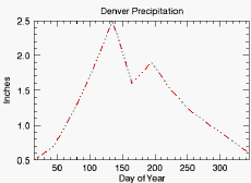
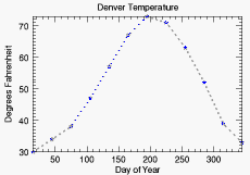
The code shown below creates the graphic shown above. You can copy the entire block and paste it into the IDL command line to run it. The keywords used are explained in detail after the example code.
PRECIP=[0.5,0.7,1.2,1.8,2.5,1.6,1.9,1.5,1.2,1.0,0.8,0.6]
TEMP=[30, 34, 38, 47, 57, 67, 73, 71, 63, 52, 39, 33]
DAY=FINDGEN(12) * 30 + 15
p1 = PLOT(DAY, PRECIP, 'r-:2', $
TITLE = 'Denver Precipitation', $
YTITLE = 'Inches', XTITLE= 'Day of Year')
p2 = PLOT(DAY, TEMP, 'bS:3', /YNOZERO, $
TITLE = 'Denver Temperature', $
XTITLE = 'Day of Year', $
YTITLE = 'Degrees Fahrenheit')
Formats Used in this Example
- r-:2 - this shorthand formatting defines some of the properties that define the appearance of the graphic. In the definition for the first plot (p1),
- r defines the color red
- -; defines the linestyle
- 2 defines the line thickness
- bS:3 - this shorthand notation defines some of the properties that define the appearance of the graphic. In the definition for the first plot (p2),
- b defines the color blue
- -: defines the linestyle
- 3 defines the line thickness
Example 2
This example uses data created by Bessel functions, along with the TEXT function for annotations.
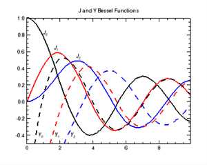
The code shown below creates the graphic shown above. You can copy the entire block and paste it into the IDL command line to run it.
X = FINDGEN(100)/10
pj0 = PLOT(X, BESELJ(X, 0), '2', $
TITLE='J and Y Bessel Functions', YRANGE=[-0.5,1])
pj1 = PLOT(X, BESELJ(X, 1), 'r2', /OVERPLOT)
pj2 = PLOT(X, BESELJ(X, 2), 'b2', /OVERPLOT)
py0 = PLOT(X, BESELY(X, 0), '--2', /OVERPLOT)
py1 = PLOT(X, BESELY(X, 1), 'r--2', /OVERPLOT)
py2 = PLOT(X, BESELY(X, 2), 'b--2', /OVERPLOT)
xcoords = [1, 1.66, 3, .7, 1.7, 2.65]
ycoords = [.8, .62,.52, -.42, -.42, -.42]
labels = '$\it' + ['J_0','J_1','J_2','Y_0','Y_1','Y_2'] + '$'
t = TEXT(xcoords, ycoords, labels, /DATA)
Example 3
This example shows how to plot two dependent variables (wind speed and direction) against one dependent variable (location).
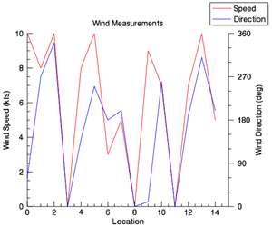
The code shown below creates the graphic shown above. You can copy the entire block and paste it into the IDL command line to run it.
file = FILE_WHICH('ascii.txt')
d = READ_ASCII(file, data_start=5)
speed = LONG(reform(d.(0)[5,*]))
direction = LONG(reform(d.(0)[6,*]))
location = INDGEN(n_elements(speed))
p_wspd = PLOT(location, speed, 'r', $
AXIS_STYLE = 1, $
MARGIN = [0.15, 0.15, 0.20, 0.15], $
NAME = 'Speed', $
XTITLE = 'Location', $
YTITLE = 'Wind Speed (kts)', $
TITLE = 'Wind Measurements')
p_wdir = PLOT(location, direction, 'b', $
/CURRENT, $
NAME = 'Direction', $
YRANGE = [0,360], $
AXIS_STYLE = 0, $
MARGIN = [0.15, 0.15, 0.20, 0.15])
a_wdir = AXIS('y', $
TARGET = p_wdir, $
MAJOR = 5, $
MINOR = 2, $
LOCATION = [max(p_wdir.xrange),0,0], $
TEXTPOS = 1, $
TITLE = 'Wind Direction (deg)')
!null = LEGEND(target=[p_wspd, p_wdir])
Resources